Posts Tagged ‘linksharing’
Can you see this post? I’m hearing that some folks can’t get my site to load. Has been a problem all day; we’re looking into it. I’m bumping the Ballet Shoes post yet another day until I’m sure the problem (whatever it is) has been resolved.
Meanwhile, noooooo! Google informs us Reader’s days are numbered. Those of us who rely on a good RSS aggregator to make the web manageable are crushed—there’s no better feed reader than Google Reader.
Some alternatives, none of them quite perfect (but I’m confident someone will rise to fill the void):
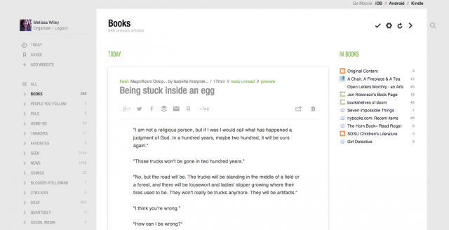
Feedly—this is probably what I’ll wind up using. Not quite as streamlined as Reader, but it offers many options for customizing the look and function. In “Full Articles” mode, it’s a decent Reader substitute:

(I subscribe to way more book blogs than are visible in that list. I think it only shows the top twelve.)
If you click on the gear icon, you can toggle to different layouts: mosaic, list, magazine-style, etc.
You can export your subscriptions at Google Reader and import them to Feedly, or simply connect Feedly to your Reader account, which is what I did. For now Feedly runs off Reader’s API but it is going to “seamlessly transition” to another source before Reader bites the dust in July.
A Feedly plus is that it has mobile apps as well, with syncing between your desktop, iOS, and Android devices. And if you connect it to your gReader account, it’ll sync with that, too, as long as gReader lasts.
You can share posts from Feedly directly to Facebook, Twitter, G+, Delicious, and other platforms. Diigo isn’t one of the preset share options and I really hope you can add it manually—haven’t figured out how yet but it’s early days—because Diigo is how I share links in my sidebar here. I suppose I could switch back to Delicious if I have to.
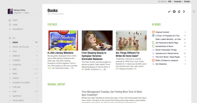
Here’s Feedly in “magazine” view:

Other options: Bloglines (what I used before Google Reader came along). NewsBlur (after a certain number of subscriptions, there’s a fee). NetNewsWire for Mac. The Old Reader. Pulp (a paid app for Mac). Flipboard for iOS devices (no good for me, as I need a desktop interface).
What’s your poison?
Related post: Sending Web Content to a Kindle for Reading Later

Photo totally unrelated to the content of this post, offered for those who may not be quite as interested in social bookmarking as I am. 🙂
I still haven’t found the one best, perfect means of sharing nifty internet finds with others. To be fair, even before Google killed off Reader Share, I was forever searching for that one best, perfect show-and-tell vehicle. Reader’s share button was so easy that I took it for granted.
Linksharing is important to me. I truly loved being able to click through to your blogs and explore your Reader Shared Items widgets. I loved that I could follow those link collections on my own Reader. I love it when someone on Google+ or Facebook or Twitter shares an intriguing bit of reading—love it so much that I’m reluctant to rely on chance to put those links before my eyes in the rapid infostream. I want an RSS feed of your nifty stuff: that’s the bottom line.
Some of you share links right on your blog, and that’s terrific. I could do that myself, have done in the past, but over time I’ve found that I prefer to keep my booknotes and family chronicle separate from my show-and-tell treasures. I’m a compartmentalizer.
This past week, I’ve experimented with Diigo as my primary linksharing vehicle. I was already using it to share booklists in my sidebar. I love how its widget folds itself neatly into my blog design. And I love that it has an RSS feed so you can subscribe if you’d like. What it’s lacking—and this is a biggie—is reciprocity. As I mentioned yesterday, I don’t like that you can’t comment on links. Sharing isn’t as much fun if it’s one-way.
 Diigo
Diigo
For a while, I was using Tumblr as a way to archive my own online reading—not necessarily links I wanted to share, but things I’d read and wanted to be able to reference later. I fell out of the habit after a while. (Around the time of Comic-Con, I see, which explains the lapse.) As a sharing platform, it has much to offer: excellent visuals (you can share [and credit!] photos and videos as well as text links); a combox; an RSS feed. But its sidebar widget is incompatible with my blog design. That’s not a dealbreaker; I’m sure there are WordPress plugins for Tumblr feeds, and anyway I’ve got a redesign planned for early next year. (New books, new look.)

Tumblr
So for now, you may find (and subscribe to) my shared links at both Tumblr and Diigo, your choice. If I decide to let one of them lapse, I’ll let you know.
If you have come up with a replacement for your Google Reader Shared Items, please leave the link in my comments!
Occurs to me I forgot to share yesterday’s GeekMom post, a follow-up to recent posts here on Bonny Glen: Why Curated Content Matters.
My Diigo share widget is working quite well. It’s a satisfactory way for me to share links with others, although it lacks the reciprocity of Reader Share; you can’t comment back on my links. But please always feel free to come here to discuss anything I’ve shared, eh?
Now what I need to know is this: where are YOU sharing curated links now that your handy Reader Share button is no more?
Posted the following to Google+ but I like to archive things on my own site.
So. New Reader.
Like:
• Share-to-Google+ is easy and convenient. Which is, of course, what Google is angling for: driving my sharing activity to this platform. Which makes this actually a dislike, because it feels like I’m being manipulated.
Dislike:
• All the white space at the top—ordinarily I’m a fan of white space (I love the clean look of G+, for example), but in New Reader’s case, it serves to push the post text a good bit farther down the page. Means more scrolling, plus I like to start reading near the top of the screen, not a third of the way down. This layout is totally unworkable for smaller screens. (more…)


