Posts Tagged ‘Google Reader’
June 21, 2013 @ 4:33 pm | Filed under:
Bloggity Only eight more days, guys, until Google Reader goes poof. Have you downloaded your data yet? Have you migrated to another reader? I’ve settled in at Feedly (will be investigating Digg Reader when it launches, though) and am mostly happy there.
I’m usually pretty eager about change—it energizes me—so I’m not sure why I’ve been so grumpy about shifting away from gReader, especially since Feedly offers some features I actually like better than Reader’s. Let’s face it, I’ve been sulking ever since Reader Share got the axe. But onward, allons-y, and all that jazz.
So here’s what I like about Feedly: the granular customization it offers. I very much like being able to customize the feed view at every level: all posts, topic folders, and each individual blog.
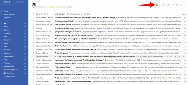
Like this. When I click on “All” (that is, all unread posts), I like the titles-only view. You can scroll quickly down and click on any post title to expand it to reveal the full post.

You change the view by clicking one of the icons by the red arrow.
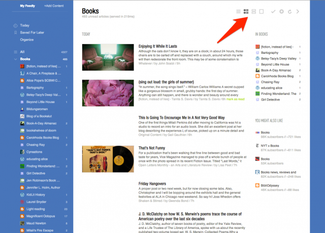
When I click on newest posts (“Today” in the sidebar) or any of my topic folders, I prefer magazine view: a thumbnail image and post excerpt.

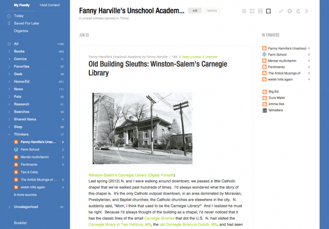
For individual blogs, I nearly always prefer full article view. As you scroll down the page, posts are automatically marked as read. You can mark them as unread with a click. I love this—it’s faster than gReader’s mark-as-unread function was.

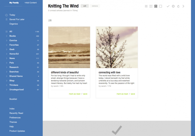
For a few particular blogs, especially ones whose feeds are excerpt-only, I choose card view instead—a larger thumbnail image plus post excerpt. (Sarah, I think your blog is exceptionally lovely in this view.) 🙂

It didn’t take me long to click through my feeds and customize these views; it’s just a simple click in that top right corner. I did it a little at a time, as I read through a few days’ posts.
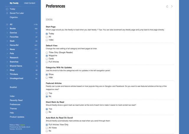
My default start page is “Today”—you can customize that in Preferences (bottom of the sidebar). You can also select a default view for all your category and feed pages, and then tweak individual blogs later.

Another feature I love: you can click the number next to a category or blog name in the sidebar, and that marks all posts in that section as read. Gotta be careful, though; I’ve done it by accident a couple of times, meaning to click a category and marking the whole darn thing as read.
(By the way, if you don’t see your blog in the lists above, don’t be offended. I’ve probably got you squirreled away in another category. I have a filing system to rival Mrs. Basil E. Frankweiler’s.)
The other thing I appreciate about Feedly is how easy it is to share links to Facebook, Twitter, and other platforms. And the bookmarking and tagging features are clutch. (Updated: Gwenda Bond just discovered all our Google Reader Starred links have been automatically migrated to Feedly’s “Save for Later” section. YES.)
You can change the colors, too! Click “Themes” at the bottom of the sidebar. I go back and forth between the blue, a soft green, and this nice, simple white layout:

Yep, it’s growing on me. How about you? Even if you land somewhere else later, now’s the time to migrate your Google Reader account to Feedly’s new cloud server.
Can you see this post? I’m hearing that some folks can’t get my site to load. Has been a problem all day; we’re looking into it. I’m bumping the Ballet Shoes post yet another day until I’m sure the problem (whatever it is) has been resolved.
Meanwhile, noooooo! Google informs us Reader’s days are numbered. Those of us who rely on a good RSS aggregator to make the web manageable are crushed—there’s no better feed reader than Google Reader.
Some alternatives, none of them quite perfect (but I’m confident someone will rise to fill the void):
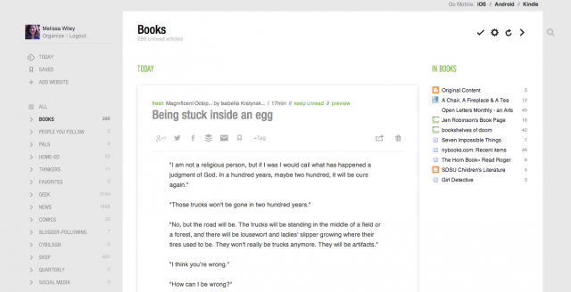
Feedly—this is probably what I’ll wind up using. Not quite as streamlined as Reader, but it offers many options for customizing the look and function. In “Full Articles” mode, it’s a decent Reader substitute:

(I subscribe to way more book blogs than are visible in that list. I think it only shows the top twelve.)
If you click on the gear icon, you can toggle to different layouts: mosaic, list, magazine-style, etc.
You can export your subscriptions at Google Reader and import them to Feedly, or simply connect Feedly to your Reader account, which is what I did. For now Feedly runs off Reader’s API but it is going to “seamlessly transition” to another source before Reader bites the dust in July.
A Feedly plus is that it has mobile apps as well, with syncing between your desktop, iOS, and Android devices. And if you connect it to your gReader account, it’ll sync with that, too, as long as gReader lasts.
You can share posts from Feedly directly to Facebook, Twitter, G+, Delicious, and other platforms. Diigo isn’t one of the preset share options and I really hope you can add it manually—haven’t figured out how yet but it’s early days—because Diigo is how I share links in my sidebar here. I suppose I could switch back to Delicious if I have to.
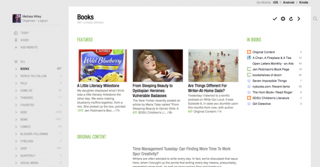
Here’s Feedly in “magazine” view:

Other options: Bloglines (what I used before Google Reader came along). NewsBlur (after a certain number of subscriptions, there’s a fee). NetNewsWire for Mac. The Old Reader. Pulp (a paid app for Mac). Flipboard for iOS devices (no good for me, as I need a desktop interface).
What’s your poison?
Related post: Sending Web Content to a Kindle for Reading Later
Following up on yesterday’s post—some good questions came up in the comments. I’ll tackle this one first: “How does the Send to Kindle app work?”
Send to Kindle
I mentioned how much I rely on Send to Kindle to read long-form posts and articles later, away from my computer. This is an official Amazon app but there are third-party equivalents, too. (See Send to Reader, below. Instapaper is another.)
How it works: I installed Send to Kindle in my browser. (There are Chrome and Firefox versions, PC and Mac desktop versions, and even an Android app.)

In Chrome, the Send to Kindle icon appears at the top right of my browser—see the orange K?
When I’m reading a post online and I want to send it to my Kindle, all I have to do is click the icon.
If I want, I can choose to send the article to the Kindle app on an iPhone, iPad, or Android device instead. Click the icon to access the settings button. This is handy if I want to send a particular article to Scott’s device instead of mine. (You may have up to six devices connected to your Kindle account at any one time.) (more…)
I get asked that question a lot, and variations thereof: how do you have time for Twitter and Facebook, how do you find time to read so many books? If you’re reading this post, you probably get asked the question too, since odds are you read many other blogs in addition to mine.
My answers used to tend toward the self-deprecatory, as if I were making an admission of guilt. Well, see, Scott does all the laundry and most of the cooking. This is at once a true statement and a completely worthless one. It conveys no useful information. It’s true that Scott and I—both of us work-at-home writers—have a well defined division of labor that puts the laundry and cooking solidly in his chore column. But I handle the bulk of the homeschooling (and even during our most unschoolish times that means a lot of planning and creative focus—arguably MORE so during our most unschoolish times), the considerable clerical and therapeutic tasks involved with nurturing a special needs child, the bills, the taxes, the scheduling, the medical and dental appointments, the overseeing of the housework, the shoe-shopping and sundry other tasks necessary to the running of a household and the raising of a large family. Deflecting the question with an explanation of what I don’t do isn’t really an answer. Or, to put it another way, Scott does all the laundry and most of the cooking, and yet he manages to read a staggering number of blogs and books too. More even than I do. (more…)
Occurs to me I forgot to share yesterday’s GeekMom post, a follow-up to recent posts here on Bonny Glen: Why Curated Content Matters.
My Diigo share widget is working quite well. It’s a satisfactory way for me to share links with others, although it lacks the reciprocity of Reader Share; you can’t comment back on my links. But please always feel free to come here to discuss anything I’ve shared, eh?
Now what I need to know is this: where are YOU sharing curated links now that your handy Reader Share button is no more?
Posted the following to Google+ but I like to archive things on my own site.
So. New Reader.
Like:
• Share-to-Google+ is easy and convenient. Which is, of course, what Google is angling for: driving my sharing activity to this platform. Which makes this actually a dislike, because it feels like I’m being manipulated.
Dislike:
• All the white space at the top—ordinarily I’m a fan of white space (I love the clean look of G+, for example), but in New Reader’s case, it serves to push the post text a good bit farther down the page. Means more scrolling, plus I like to start reading near the top of the screen, not a third of the way down. This layout is totally unworkable for smaller screens. (more…)
…and I will miss your Shared Items sidebar widgets.
As you’ve probably heard by now, Google is shifting Reader toward a format more integrated with Google+:
As a result of these changes, we also think it’s important to clean things up a bit. Many of Reader’s social features will soon be available via Google+, so in a week’s time we’ll be retiring things like friending, following and shared link blogs inside of Reader.
(Sorry if this was confusing earlier—I forgot to blockquote the above.)
Well, dadgummit. I really like Google+, and I’m all for change if it makes things more convenient, but I have loved Reader’s sharing function. I especially love the “people you follow” part. Scott (among others I follow) routinely shares highly interesting items from his massive daily blogreading. Convenience is key: currently it requires no more effort on his part than clicking that Share button. I hope the new method is as easy—on both the sharing and reading ends.
Here’s a link to a Google+ sidebar widget. I’ll probably replace my “Made Me Click” sidebar widget with it.
