Adjusting to Feedly
Only eight more days, guys, until Google Reader goes poof. Have you downloaded your data yet? Have you migrated to another reader? I’ve settled in at Feedly (will be investigating Digg Reader when it launches, though) and am mostly happy there.
I’m usually pretty eager about change—it energizes me—so I’m not sure why I’ve been so grumpy about shifting away from gReader, especially since Feedly offers some features I actually like better than Reader’s. Let’s face it, I’ve been sulking ever since Reader Share got the axe. But onward, allons-y, and all that jazz.
So here’s what I like about Feedly: the granular customization it offers. I very much like being able to customize the feed view at every level: all posts, topic folders, and each individual blog.
Like this. When I click on “All” (that is, all unread posts), I like the titles-only view. You can scroll quickly down and click on any post title to expand it to reveal the full post.
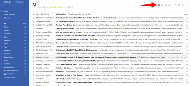
You change the view by clicking one of the icons by the red arrow.
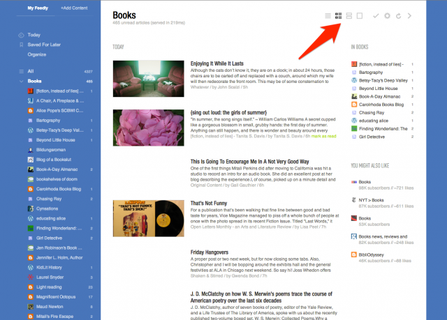
When I click on newest posts (“Today” in the sidebar) or any of my topic folders, I prefer magazine view: a thumbnail image and post excerpt.
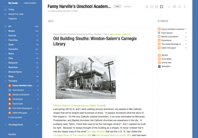
For individual blogs, I nearly always prefer full article view. As you scroll down the page, posts are automatically marked as read. You can mark them as unread with a click. I love this—it’s faster than gReader’s mark-as-unread function was.
For a few particular blogs, especially ones whose feeds are excerpt-only, I choose card view instead—a larger thumbnail image plus post excerpt. (Sarah, I think your blog is exceptionally lovely in this view.) 🙂
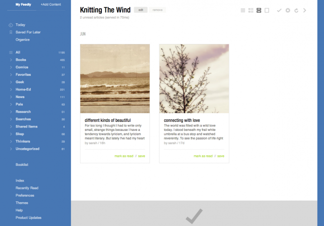
It didn’t take me long to click through my feeds and customize these views; it’s just a simple click in that top right corner. I did it a little at a time, as I read through a few days’ posts.
My default start page is “Today”—you can customize that in Preferences (bottom of the sidebar). You can also select a default view for all your category and feed pages, and then tweak individual blogs later.
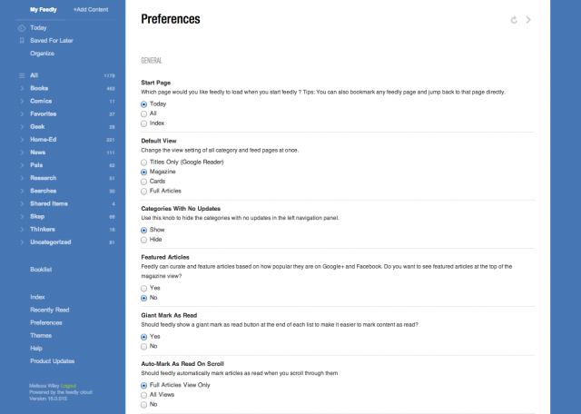
Another feature I love: you can click the number next to a category or blog name in the sidebar, and that marks all posts in that section as read. Gotta be careful, though; I’ve done it by accident a couple of times, meaning to click a category and marking the whole darn thing as read.
(By the way, if you don’t see your blog in the lists above, don’t be offended. I’ve probably got you squirreled away in another category. I have a filing system to rival Mrs. Basil E. Frankweiler’s.)
The other thing I appreciate about Feedly is how easy it is to share links to Facebook, Twitter, and other platforms. And the bookmarking and tagging features are clutch. (Updated: Gwenda Bond just discovered all our Google Reader Starred links have been automatically migrated to Feedly’s “Save for Later” section. YES.)
You can change the colors, too! Click “Themes” at the bottom of the sidebar. I go back and forth between the blue, a soft green, and this nice, simple white layout:

Yep, it’s growing on me. How about you? Even if you land somewhere else later, now’s the time to migrate your Google Reader account to Feedly’s new cloud server.

